Creative and messaging
Every accommodation provider has a different set of key Unique Selling Points (USP’s) dependant on location/proximity to university campus, target audience (First Year/Returners/International), and relevant rent prices/incentives. It’s important to set clear campaign messages prior to agreeing any creative look/feel as all creative should complement that messaging. Always highlight the current priorities for students in your messaging by providing the main reasons to choose your accommodation, along with the relevant call to action (CTA). Consistency is key, once the overall messaging and strapline has been agreed, ensure that this is consistently applied across all campaign collateral as this will help build awareness of the campaign.
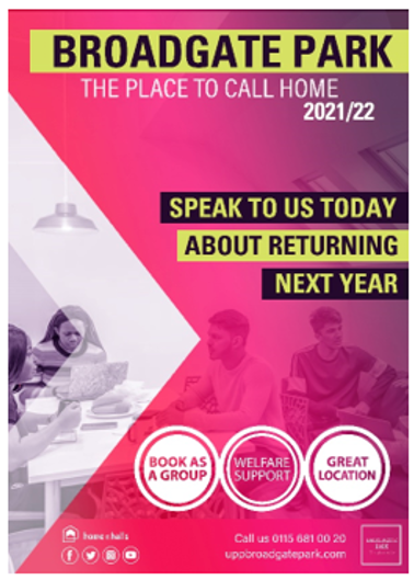
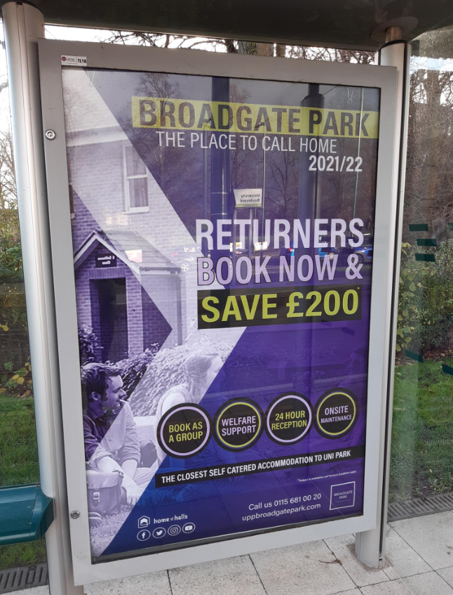
When planning for any campaign you need to ensure that all design work is created to suit all appropriate platforms whether your campaign is hard or soft copy. With any hard copy (flyers, posters etc) keep in mind relevant dimensions with your printing company and always check technical specifications prior to the setup of your design work. Consider the location of your printed work, where will it be displayed and plan your creative around the location; this is key to ensure your message is prominent regardless of the location. When focussing on a digital campaign be aware of all sizing/pixel dimensions or any restrictions for the main platforms to ensure a simple launch of the relevant phase of your campaign.
Campaign design
Each campaign should promote one idea and follow a consistent theme. Effective campaigns have professional and striking designs which can be adapted for a broad range of collateral. Each campaign needs a consistent look and feel so that it may be instantly recognised across multiple channels including, print, web, and social media, to reinforce the message.
The following steps are recommended to design an effective returners campaign:
- Once the overall campaign goal has been decided (such as increasing awareness of returner accommodation prior to opening or to increase returner group bookings etc.) the target audience and their preferred platforms can be established.
- It is important to consider what type of content the target student audience most engage with on these platforms. (Video content is recommended as students engage with, and recall, more from video than any other form of web content).
- List what assets will be required such as:
- Print advertisements – flyers, banners, posters, table talkers, parcel sticker, student newspaper advertisements
- Email design
- Website landing pages and banners
- Social media profile, cover images and display advertisements
- Social media post templates
- Video content
- Ensure the design is consistent across all assets and that key information is available at a glance. The main offer/benefit for the reader should be the focal point and not cluttered with additional features. Visuals should tell as much of the story as possible so that text can be kept to a minimum.
- Once the design is completed the campaign should be continually monitored to understand how students are engaging with it so improvements may be made.
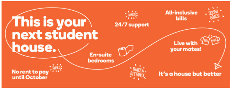
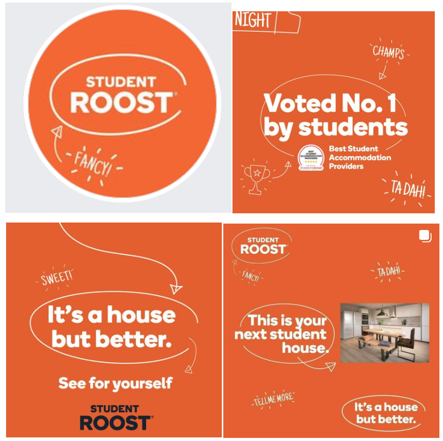
Student Roost – Social Media Campaign Design https://www.facebook.com/StudentRoostUK
University of Hull – Returners campaign
https://hull.theaccommodationhub.com/returners

Student generated content
It is beneficial to use student generated content within returner campaigns to make them more relatable, credible and engaging. By incorporating the voice of peers, content is more likely to resonate with students. This is particularly important with regards to returner campaigns where the content can be used to address standard queries, reassuring students and increasing the confidence to book.
Blogs
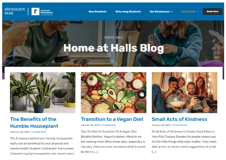
Student blogs are useful to address key themes such as re-booking with friends, the returner community and life in halls past the first year. This is useful for students to read when considering their options by providing an authentic viewpoint. Blog posts are most useful when content is concise, relevant and easy to skim read. Current students can compile blogs on what matters most to them when re-booking hall accommodation such as convenience, security, support and staying close to campus etc. By optimizing content with key words, this also increases the searchability of the web page.
Vlogs
Vlogs have the most impact of all student generated content because users are more likely to click on content that includes video and secondly they may be rapidly shared across social media platforms increasing both reach and engagement. Students are used to this format and now expect this type of content to be available on social media and/or the website. Student vlogs permit prospective applicants to get a feel for life in halls as a returner, this format has a more personal touch and more information can be provided (and recalled) compared to blogs. Vloggers can showcase the accommodation and facilities whilst speaking with genuine enthusiasm about life as a returner.

Testimonials
Text testimonials are powerful and even more so when supplemented with relevant images or video. Testimonials can be strategically placed on a landing page and used within promotional video and social media content. Testimonials are best used when aligned to the specific features that are being actively promoted in that campaign, such as a great residence community or the all-inclusive rent for example.
The use of high-quality imagery/video
High quality, relevant and consistent imagery is required to showcase the accommodation. For returner campaigns, the imagery must illustrate the student lifestyle and community within the residence as strong selling points. Rooms and communal areas should be styled, well-lit and presented not just for consistency but to improve the perception of the accommodation. An image library of student lifestyle shots is useful for refreshing campaigns.
Videos should be shot in the highest quality and must be effective in both vertical and horizontal formats aligned for mobile. A professional video can provide all the information required to persuade a prospective applicant to proceed with a booking and has the benefit of being able to be shared across multiple platforms. Students expect to see video content on websites and social media so a professional video, consistent with the available photography, is advisable.
Video content performs well in addressing the interests of the user in an easily accessible way. Video can be used to quickly answer the main queries associated with re-booking hall accommodation:
- What are the benefits of returning to halls?
- What is the application process?
- Can I book to live with friends?
- Can I keep my own room?
- Is there a returner community?
- Will I be allocated with other returning students?
- Are discounts/incentives available?
- Can my belongings be stored over the summer months?
Life in Halls – Leeds Beckett https://youtu.be/ynCUMGcGhnQ
Website/landing page content
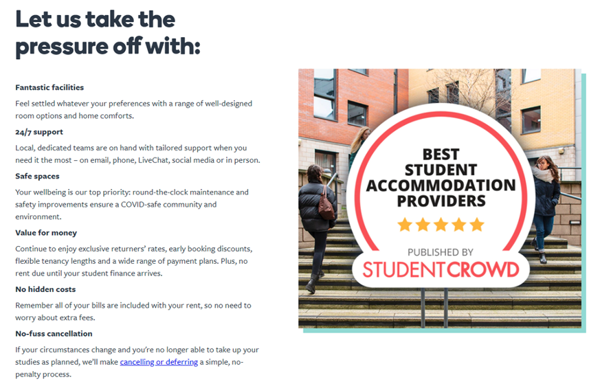
The website landing page for a returners campaign should contain a creative tie-in to the overall look and feel to ensure a visually smooth customer journey from the original source (an email, social media post or digital advert) to the landing page where visitors will be clicking through to find out more information.
The content on the page should be easily scannable, which can be achieved by including headlines, buttons, bullet points and image captions. The copy should only focus on valuable information addressing what matters most to the audience and answering the most common queries. It is important that the website messaging resonates with the reader so adopting a more informal tone and supplementing this with relevant images helps guide the reader through the process in an entertaining and informative way.
Throughout the copy there should be a prominent call to action which the reader can easily complete in one simple step. For a returner web page, a book/apply now button should be prominent throughout, it is also advisable to have a contact form to answer any specific queries. The website copy should provide enough information to encourage students to take the next step and book their accommodation.
https://www.unitestudents.com/stay-together-as-a-bunch
https://www.kent.ac.uk/accommodation/canterbury/returners-2021
https://www.studentroost.co.uk/rebook
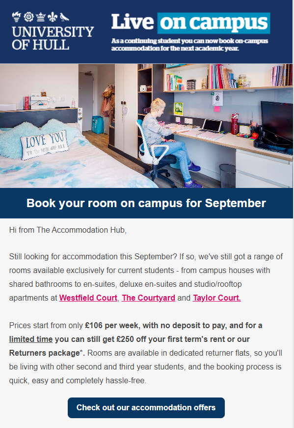
A well-crafted subject heading is the first stage in ensuring that the recipient is intrigued into finding out more and opening the email. The subject line should include a benefit to the recipient as well as being clear about the email content. Personalisation elements also increase engagement if the system allows the functionality. Email messaging may be effectively tailored to different groups of students to improve engagement. A useful exercise is to create audience segments which effectively target different types of students you are trying to reach so that the messaging can be tailored, for example you may want to write a different email to current students living in halls, to current students living off campus for a returners campaign. International, final year, postgraduate, and placement course students can also be grouped separately to receive targeted emails.
All email content should include a call to action, whether this be a click through to a landing page for more information or a link to the portal to secure the booking.
Print campaigns
Print advertisements used in returner campaigns usually take the form of:
- Flyers and posters
- Banners
- Bus/tram stop advertisements
- Student newspaper advertisements
- Table talkers
- Parcel stickers
Written content within print campaigns works best when there is an attention-grabbing headline encouraging the reader to peruse the rest of the content. The main benefit or incentive should be the focal point of the content and supported by relevant images allowing the reader to easily understand and recall the message from a quick glance. There should be plenty of space with the content broken up into digestible sections. Contrasting colours can be used to draw attention to different areas within the advertisement.
